
Lesson overview
Box Plots is part of GCSE Maths Statistics.
Draw and interpret box plots from a five-number summary, find the interquartile range and compare distributions using median and spread. Questions may ask for accurate drawing, interpretation or a cautious comparison in context.
What you will learn
Key facts before you start
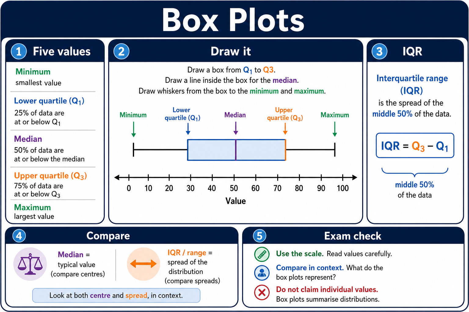
Box plots infographic
Before viewing
Before viewing, identify the median and interquartile range on the box plot.
After viewing
After viewing, compare two box plots using median and spread.
Why this matters
Box plots give a compact comparison of two distributions without showing every data value.
Prior knowledge
You should already be comfortable with:
Clear explanation
Main idea
A box plot shows five key values: minimum, lower quartile, median, upper quartile and maximum. The box contains the middle 50% of the data.
Method
Draw a number line, mark the five values accurately, draw the box from Q1 to Q3, put the median line inside the box, then add whiskers to the minimum and maximum.
When you read a value from a drawn box plot, use the scale first. A small box means the middle 50% is tightly grouped; a long whisker means one side of the data is more spread out, but it does not tell you every individual value.
Answer tip
When comparing two box plots, mention the median for the typical value and the IQR or range for spread. Do not claim anything about individual values unless the plot shows it.
Worked examples
Drawing from a five-number summary
A data set has minimum 5, Q1 = 12, median = 18, Q3 = 29 and maximum 36.
Reveal answer
Answer: Draw whiskers to 5 and 36, and the box from 12 to 29 with a median line at 18.
Comparing delivery times
Shop A has median 32 minutes and IQR 9 minutes. Shop B has median 29 minutes and IQR 16 minutes.
Reveal answer
Answer: Shop B is typically quicker, but Shop A has more consistent delivery times.
Reading skew from a box plot
A box plot has minimum 8, Q1 = 14, median = 17, Q3 = 22 and maximum 39.
Reveal answer
Answer: The distribution is positively skewed, because the long right whisker shows a tail towards the larger values.
Quick checks
Choose an answer, then check your thinking.
1. What does the box in a box plot represent?
2. Which pair should you use to compare typical value and spread?
Practice questions
Question 1
A box plot summarises revision scores. It has Q1 = 14 and Q3 = 31. Find the interquartile range of the middle half of the scores.
Reveal answer and marking guidance
Answer: 17.
Marking: IQR = Q3 − Q1 = 31 − 14 = 17.
Question 2
You are given a raw data set and asked to draw a box plot. Write the five summary values you need before drawing it.
Reveal answer and marking guidance
Answer: Minimum, lower quartile, median, upper quartile, maximum.
Marking: Give all five values in order.
Question 3
Class A has median test score 62 and IQR 8. Class B has median test score 58 and IQR 15. Compare the typical score and consistency of the two classes.
Reveal answer and marking guidance
Answer: Class A has the higher typical score and is more consistent because its median is higher and its IQR is smaller.
Marking: Mention both median and spread in context.
Question 4
On a box plot of delivery times, the right-hand whisker reaches 44 minutes. What does that value represent?
Reveal answer and marking guidance
Answer: The maximum value is 44.
Marking: The right-hand whisker ends at the maximum on a standard box plot.
Question 5
A data set of plant heights has minimum 6 cm, Q1 = 11 cm, median = 17 cm, Q3 = 25 cm and maximum 38 cm. State the range and interquartile range.
Reveal answer and marking guidance
Answer: Range 32 cm; interquartile range 14 cm.
Marking: Range = 38 − 6 = 32 cm. IQR = 25 − 11 = 14 cm.
Question 6
Two box plots show delivery times. Company X has median 28 minutes and IQR 6 minutes. Company Y has median 25 minutes and IQR 14 minutes. Write a careful comparison.
Reveal answer and marking guidance
Answer: Company Y is typically quicker because its median is lower, but Company X is more consistent because its IQR is smaller.
Marking: Use the context correctly: lower delivery time is quicker, and smaller IQR means more consistent times.
Question 7
A box plot has minimum 12, Q1 = 18, median = 24, Q3 = 37 and maximum 45. Find the range and IQR.
Reveal answer and marking guidance
Answer: Range 33; IQR 19.
Marking: Range = 45 − 12 = 33 and IQR = 37 − 18 = 19.
Question 8
In a box plot, the box runs from 22 to 34 and the median line is at 31. What do these three values represent?
Reveal answer and marking guidance
Answer: Q1 = 22, median = 31 and Q3 = 34.
Marking: Identify the left edge of the box as Q1, the line inside the box as the median and the right edge as Q3.
Question 9
Group P has median 46 and IQR 18. Group Q has median 46 and IQR 7. Compare the groups.
Reveal answer and marking guidance
Answer: The groups have the same typical value, but Group Q is more consistent because its IQR is smaller.
Marking: State that the medians are equal and compare spread using the IQR.
Question 10
A box plot has Q1 = 13 and Q3 = 27. What percentage of the data lies between these values, and what interval does this middle section cover?
Reveal answer and marking guidance
Answer: 50% of the data lies between 13 and 27.
Marking: The box from Q1 to Q3 contains the middle 50% of the data. State both the percentage and the interval shown by the box.
Answers and marking guidance
The exact practice answers are hidden under each question so you can try first. For box plots, marks usually come from reading the scale accurately, placing all five summary values correctly and comparing distributions with precise language. Use the median for typical value, the IQR for the spread of the middle half, and the range when the question asks about the full spread.
Common mistakes
- Swapping Q1 and the minimum: the whisker starts at the minimum, while the box starts at Q1.
- Forgetting the median line: the median belongs inside the box, not necessarily in the centre.
- Comparing only one feature: a strong comparison usually mentions both average and spread.
- Inventing detail: a box plot summarises data; it does not show every individual value.
Extension challenge
Compare two classes using five-number summaries: Class A has 8, 12, 16, 22, 30 and Class B has 6, 10, 18, 26, 34. State which has the greater median and which has the greater interquartile range.
Reveal answer
Example answer: Class B has the greater median, 18 compared with 16. Class B also has the greater interquartile range, 26 - 10 = 16 compared with 22 - 12 = 10.
Exam-board guidance
Box Plots appears within GCSE Maths statistics where pupils summarise and compare distributions. The shared skill is to draw from a five-number summary, find IQR and write comparisons using median and spread rather than vague visual impressions.
AQA GCSE Maths
Focus on the shared method, notation and checking habit; wording and context can vary by route.
OCR GCSE Maths
Show clear method steps and use precise notation; question wording may vary by route.
Pearson Edexcel GCSE Maths
Keep working visible and check units or notation; contexts may vary by route.
Eduqas GCSE Maths
Use the same core skill in practical contexts, with clear reasoning and final checks.
WJEC Wales
Connect the method to the context and state what the result means.
CCEA GCSE Maths
Make each method step visible and keep notation, units and final checks clear.
Next lesson
Next, continue with Histograms.