
Lesson overview
Cumulative Frequency is part of GCSE Maths Statistics.
Build cumulative frequency tables, plot upper class boundaries, and estimate the median, quartiles and interquartile range from a curve. Questions often ask you to compare two distributions using both typical value and spread.
What you will learn
Key facts before you start
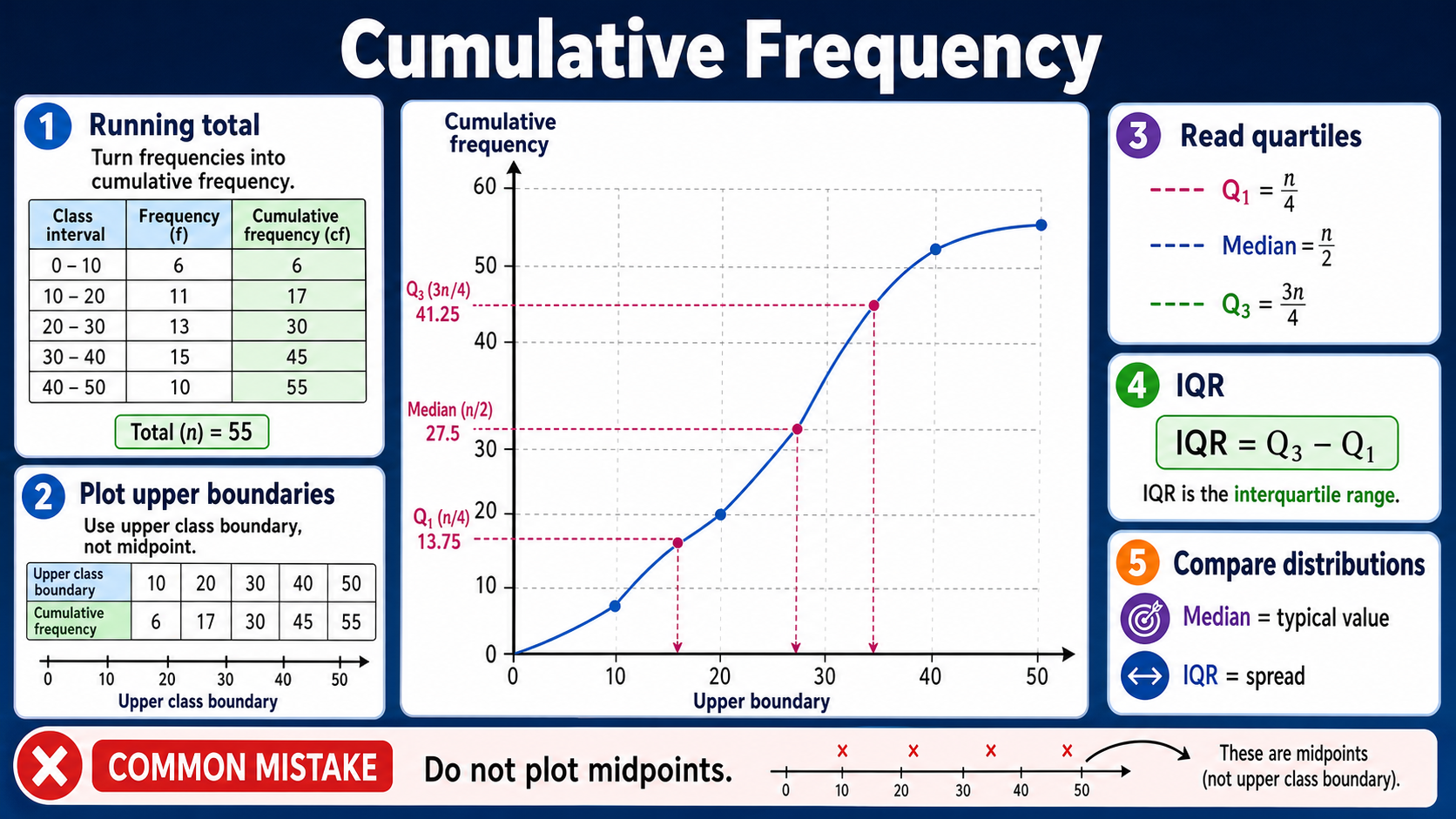
Cumulative frequency infographic
Before viewing
Before viewing, identify the running totals and upper class boundaries.
After viewing
After viewing, read a median or quartile from a cumulative frequency curve.
Why this matters
Cumulative frequency is used for large grouped data where individual values are not listed.
Prior knowledge
You should already be comfortable with:
Clear explanation
Main idea
Cumulative frequency means running total. For grouped data, each plotted point shows how many values are less than or equal to the upper class boundary.
Method
Add the frequencies down the table, plot each upper boundary against its cumulative frequency, then draw a smooth increasing curve. Use half the total for the median, one quarter for Q1 and three quarters for Q3.
For grouped intervals such as 20 < x ≤ 30, the plotted x-value is 30 because the cumulative total counts everything up to that upper boundary. If the first class begins at 0, it is often sensible to begin the curve at (0, 0) before plotting the running totals.
Answer tip
Graph readings are estimates. Show construction lines and compare distributions with two ideas: median for typical value and IQR for spread.
Worked examples
Finding quartile positions
A grouped data set has total frequency 80.
Reveal answer
Answer: Read Q1 at cumulative frequency 20, the median at 40 and Q3 at 60.
Building the running totals
A grouped table has intervals 0 < x ≤ 10, 10 < x ≤ 20, 20 < x ≤ 30 with frequencies 7, 11 and 12.
Reveal answer
Answer: Plot the upper boundaries 10, 20 and 30 against the running totals 7, 18 and 30.
Estimating spread from graph readings
A cumulative frequency curve represents 120 plants. From the graph, Q1 is about 18 cm, the median is about 25 cm and Q3 is about 34 cm.
Reveal answer
Answer: The typical plant height is about 25 cm, and the middle half of the plants have heights spread over about 16 cm.
Quick checks
Choose an answer, then check your thinking.
1. Which class value do you plot on a cumulative frequency graph?
2. For 120 values, where is the median read?
Practice questions
Question 1
A grouped table records 6, 9, 15 and 10 pupils in four time intervals for a homework task. Write the cumulative frequencies ready for plotting.
Reveal answer and marking guidance
Answer: 6, 15, 30, 40.
Marking: Add each new frequency to the running total.
Question 2
A cumulative frequency graph represents 64 students. At which cumulative frequency should you draw the horizontal line to read the median from the curve?
Reveal answer and marking guidance
Answer: 32.
Marking: The median is at half the total frequency: 64 ÷ 2 = 32.
Question 3
For the same 64 students, at which cumulative frequencies should you read Q1 and Q3 before using construction lines on the graph?
Reveal answer and marking guidance
Answer: Q1 at 16 and Q3 at 48.
Marking: Use one quarter and three quarters of 64.
Question 4
A cumulative frequency graph for journey times gives Q1 = 22 minutes and Q3 = 37 minutes. Find the interquartile range and include the unit.
Reveal answer and marking guidance
Answer: 15 minutes.
Marking: IQR = Q3 − Q1 = 37 − 22 = 15 minutes.
Question 5
A grouped table for waiting times uses intervals 0 < x ≤ 10, 10 < x ≤ 20, 20 < x ≤ 40 and 40 < x ≤ 60 with frequencies 8, 12, 25 and 15. Write the points you would plot for a cumulative frequency curve.
Reveal answer and marking guidance
Answer: (10, 8), (20, 20), (40, 45), (60, 60).
Marking: Use upper class boundaries for the x-coordinates and running totals for the y-coordinates.
Question 6
Two cumulative frequency curves each represent 80 values. Group A has median 34 and IQR 12. Group B has median 31 and IQR 20. Compare the two groups.
Reveal answer and marking guidance
Answer: Group A has the higher typical value and is more consistent, because its median is higher and its IQR is smaller.
Marking: Mention both median and IQR, and use comparative language rather than only listing the numbers.
Question 7
Frequencies in four classes are 4, 13, 18 and 5. Write the final cumulative frequency and explain what it represents.
Reveal answer and marking guidance
Answer: 40; it represents the total number of values.
Marking: Add all frequencies: 4 + 13 + 18 + 5 = 40.
Question 8
A grouped table uses classes 0 < x ≤ 5, 5 < x ≤ 15 and 15 < x ≤ 25 with frequencies 3, 9 and 8. Write the cumulative frequency plotting points.
Reveal answer and marking guidance
Answer: (5, 3), (15, 12), (25, 20).
Marking: Use upper class boundaries and cumulative totals, not class widths or midpoints.
Question 9
A cumulative frequency curve for 100 runners gives Q1 = 18 minutes and Q3 = 31 minutes. Find the interquartile range and interpret it.
Reveal answer and marking guidance
Answer: IQR = 13 minutes; the middle 50% of runners' times are spread over about 13 minutes.
Marking: Subtract Q1 from Q3 and describe the spread in the context.
Question 10
A cumulative frequency curve represents 96 delivery times. State the cumulative frequencies for Q1, the median and Q3. The graph readings are Q1 = 14 minutes, median = 21 minutes and Q3 = 33 minutes. Find the IQR.
Reveal answer and marking guidance
Answer: Q1 is read at 24, the median at 48 and Q3 at 72. The IQR is 19 minutes.
Marking: Use one quarter, one half and three quarters of 96 for the graph positions. Then subtract the graph readings: 33 − 14 = 19 minutes.
Answers and marking guidance
The exact practice answers are hidden under each question so you can try first. For cumulative frequency, marks usually come from correct running totals, plotting upper class boundaries, drawing a smooth increasing curve and reading estimates with construction lines. When comparing two distributions, mention the median for the typical value and the interquartile range for consistency or spread.
Common mistakes
- Plotting midpoints: cumulative frequency graphs use upper class boundaries, not class midpoints.
- Losing the running total: each cumulative frequency must include all previous groups.
- Using quartile positions incorrectly: Q1, median and Q3 are read at one quarter, one half and three quarters of the total frequency.
- Only comparing medians: distribution comparisons usually need a comment about spread as well.
Extension challenge
A grouped table has cumulative frequencies 5, 18, 34, 48 and 60. Estimate where the median and quartiles would be read from on the cumulative-frequency graph.
Reveal answer
Example answer: With 60 values, read Q1 at the 15th value, the median at the 30th value and Q3 at the 45th value, then use the graph to estimate the matching data values.
Exam-board guidance
Cumulative Frequency appears within GCSE Maths statistics, especially for grouped data and distribution comparison. The shared skill is to build running totals, plot the curve accurately, estimate median and quartiles, and explain what those estimates mean in context.
AQA GCSE Maths
Focus on the shared method, notation and checking habit; wording and context can vary by route.
OCR GCSE Maths
Show clear method steps and use precise notation; question wording may vary by route.
Pearson Edexcel GCSE Maths
Keep working visible and check units or notation; contexts may vary by route.
Eduqas GCSE Maths
Use the same core skill in practical contexts, with clear reasoning and final checks.
WJEC Wales
Connect the method to the context and state what the result means.
CCEA GCSE Maths
Make each method step visible and keep notation, units and final checks clear.
Next lesson
Next, continue with Box Plots.