
Lesson overview
Scatter Graphs and Correlation is part of GCSE Maths Statistics.
Use scatter graphs to plot paired data, describe correlation, draw a line of best fit and judge whether an estimate is sensible. Questions may ask for a description in context, an interpolated value or an explanation of why correlation is not the same as causation.
What you will learn
Key facts before you start
Visual summary
Scatter Graphs and Correlation visual summary
Before viewing
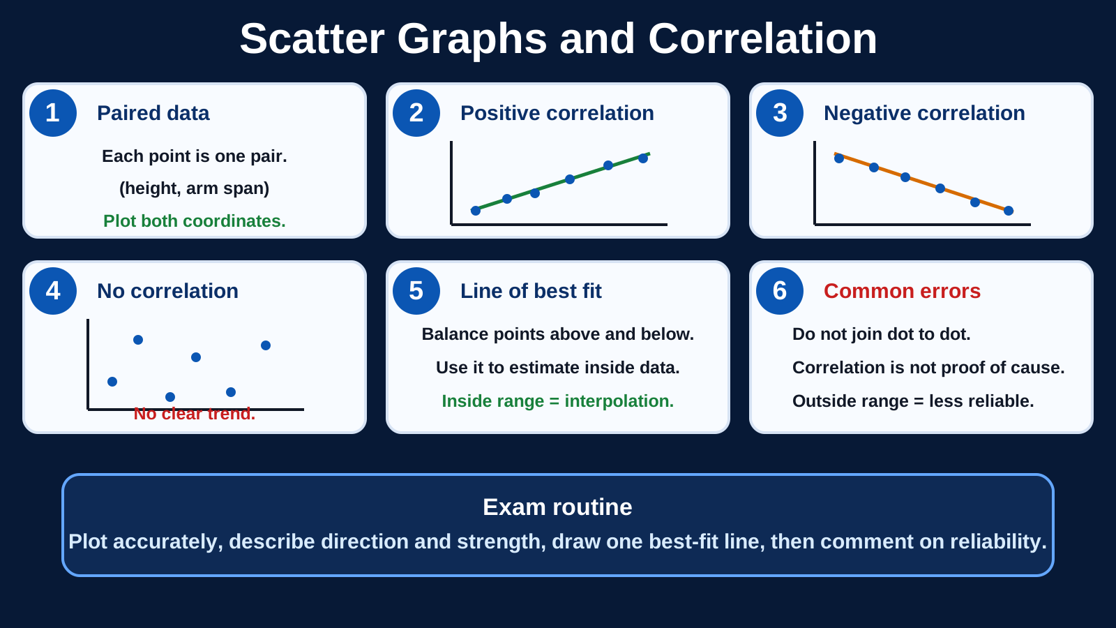
Before viewing, decide whether the scatter pattern is positive, negative or no correlation.
After viewing
After viewing, make one sensible estimate using the line of best fit.
Why this matters
Scatter graphs help spot relationships in real data, but the interpretation needs care.
Prior knowledge
You should already be comfortable with:
Clear explanation
Main idea
A scatter graph shows paired data. Positive correlation means the points tend to rise as you move left to right. Negative correlation means they tend to fall. No correlation means there is no clear pattern.
Method
Plot each pair from the two scales, describe the trend, then draw a line of best fit through the middle of the points if an estimate is needed. Use it mainly for interpolation: estimates inside the range of the data.
If one point is far away from the pattern, call it an outlier or unusual point and decide whether it should affect the best-fit line. Extrapolation, where you estimate outside the plotted range, can be useful for a rough prediction but is much less reliable than interpolation.
Answer tip
Say what the correlation means in the context of the question. Do not write that one variable causes the other unless the question gives extra evidence.
Worked examples
Using a line of best fit
A scatter graph compares revision time with test score. A line of best fit passes through about (2, 38) and (6, 70).
Reveal answer
Answer: A sensible estimate is about 62 marks, and it is interpolation because 5 hours is inside the plotted range.
Spotting a weak estimate
Data were plotted for x-values from 4 to 16. A pupil uses the line of best fit to predict y when x = 24.
Reveal answer
Answer: The estimate is less reliable because it is extrapolation beyond the plotted data.
Judging a best-fit line
A pupil draws a scatter graph with positive correlation. Their line of best fit goes through the origin, but all the plotted points lie between x = 3 and x = 9 and cluster around y = 20 to y = 55.
Reveal answer
Answer: The line is not suitable unless the trend supports it; draw a balanced line through the main cluster of points instead.
Quick checks
Choose an answer, then check your thinking.
1. Points rise from left to right. What correlation is shown?
2. An estimate beyond the plotted data range is called what?
Practice questions
Question 1
A scatter graph of outdoor temperature and ice-cream sales slopes upward from left to right. Describe the correlation in context.
Reveal answer and marking guidance
Answer: Positive correlation: as outdoor temperature increases, ice-cream sales tend to increase.
Marking: Name the correlation and refer to both variables in context.
Question 2
The plotted revision times range from 1 hour to 7 hours. Using the best-fit line to estimate the score for 5 hours is interpolation or extrapolation?
Reveal answer and marking guidance
Answer: Interpolation.
Marking: 5 hours lies inside the plotted data range of 1 to 7 hours.
Question 3
A tutor draws a line of best fit for revision time against test score. At 3 hours, the line reads 48 marks. What estimate should you write, and why should it be approximate?
Reveal answer and marking guidance
Answer: About 48 marks.
Marking: Give an approximate value because it is read from a graph.
Question 4
A scatter graph shows positive correlation between shoe size and reading age in a primary school. Why should you avoid saying bigger shoes cause better reading?
Reveal answer and marking guidance
Answer: Correlation does not prove causation; age could explain both variables.
Marking: State that another factor may cause the pattern.
Question 5
A science class plots hours spent revising against quiz score. The line of best fit passes through about (2, 30) and (8, 66). Estimate the score when x = 5 hours.
Reveal answer and marking guidance
Answer: About 48.
Marking: The line rises 36 over 6 x-units, so the gradient is about 6 per x-unit. From x = 2 to x = 5 is 3 units, so 30 + 3 × 6 = 48.
Question 6
The plotted x-values run from 10 to 40. A pupil uses the line of best fit to estimate y when x = 55. What should they say about reliability?
Reveal answer and marking guidance
Answer: The estimate is extrapolation and is less reliable because 55 is outside the plotted data range.
Marking: Name extrapolation and explain that the estimate goes beyond the data shown.
Question 7
A line of best fit passes through about (4, 18) and (10, 42). Estimate y when x = 7.
Reveal answer and marking guidance
Answer: About 30.
Marking: The rise is 24 over 6 x-units, so the gradient is about 4. From x = 4 to x = 7 is 3 units, so 18 + 3 × 4 = 30.
Question 8
Most points follow a downward trend, but one point is far above the rest. What should you call that point?
Reveal answer and marking guidance
Answer: An outlier or unusual point.
Marking: Use accepted correlation vocabulary and say it does not fit the main pattern.
Question 9
A scatter graph of car age and resale value slopes downward from left to right. Describe the correlation in context.
Reveal answer and marking guidance
Answer: Negative correlation: as car age increases, resale value tends to decrease.
Marking: Name negative correlation and link both variables to the real context.
Question 10
A line of best fit passes through about (10, 34) and (50, 74). Estimate y when x = 35, and say whether this is interpolation or extrapolation if the plotted x-values run from 10 to 50.
Reveal answer and marking guidance
Answer: About 59; this is interpolation.
Marking: The line rises 40 over 40 x-units, so the gradient is about 1. From x = 10 to x = 35 is 25 units, so 34 + 25 = 59. The estimate is inside the plotted range.
Answers and marking guidance
The exact practice answers are hidden under each question so you can try first. For scatter graphs, marks usually come from accurate plotting, a clear trend description, a sensible best-fit line and contextual interpretation. Use “about” for graph readings, distinguish interpolation from extrapolation, and avoid causal claims unless the question gives evidence for them.
Common mistakes
- Forgetting the context: write “as temperature increases, sales tend to increase”, not just “positive”.
- Forcing a line through every point: a best-fit line follows the overall trend with points roughly balanced either side.
- Trusting extrapolation too much: estimates outside the data range are usually less reliable.
- Claiming causation: correlation shows association, not proof that one variable causes the other.
Extension challenge
Sketch a scatter graph with positive correlation between revision time and quiz score. Add one outlier and explain why a line of best fit should follow the overall pattern, not the outlier.
Reveal answer
Example answer: The line should pass through the middle of the main cluster. One unusual point should be noted, but it should not drag the line away from the overall positive trend.
Exam-board guidance
Scatter Graphs and Correlation appears within the statistics content used by the supported GCSE Maths routes. The shared skill is to plot paired data accurately, describe the relationship, use a line of best fit sensibly and interpret the result in context.
AQA GCSE Maths
Focus on the shared method, notation and checking habit; wording and context can vary by route.
OCR GCSE Maths
Show clear method steps and use precise notation; question wording may vary by route.
Pearson Edexcel GCSE Maths
Keep working visible and check units or notation; contexts may vary by route.
Eduqas GCSE Maths
Use the same core skill in practical contexts, with clear reasoning and final checks.
WJEC Wales
Connect the method to the context and state what the result means.
CCEA GCSE Maths
Make each method step visible and keep notation, units and final checks clear.
Next lesson
Next, continue with Cumulative Frequency.