
Lesson overview
Tables, Charts and Diagrams is part of GCSE Maths Statistics.
Read, draw and critique common statistical diagrams accurately. Questions may ask you to complete a table, calculate pie-chart angles, choose a suitable chart or explain why a scale is misleading.
What you will learn
Key facts before you start
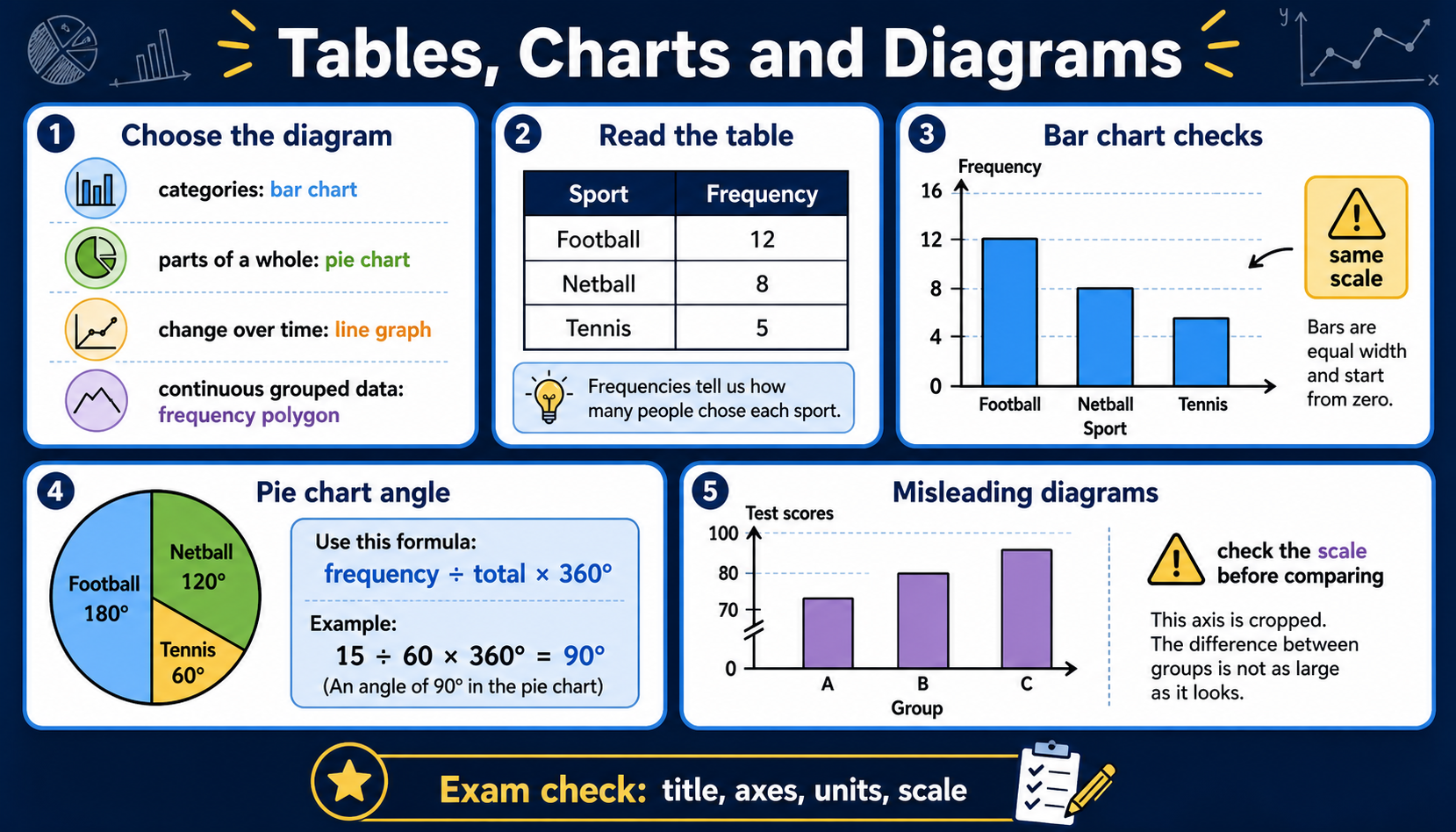
Tables, charts and diagrams infographic
Before viewing
Before viewing, identify the chart type and what each axis or category represents.
After viewing
After viewing, choose the best chart for one data set and justify it.
Why this matters
Charts turn data into evidence, but only when scales, labels and categories are handled honestly.
Prior knowledge
You should already be comfortable with:
Clear explanation
Main idea
Bar charts compare categories or discrete values. Bars should have equal width and clear gaps for categories. Histograms are different because they show continuous grouped data using frequency density.
Method
Pie charts show parts of a whole. Each sector angle is frequency ÷ total × 360°. Line charts and time-series graphs show change over time, so the horizontal axis should use equal time intervals.
Answer tip
Before interpreting any chart, check the title, axis labels, units, scale and total. A truncated or uneven scale can exaggerate differences.
A frequency polygon is useful for comparing grouped numerical data. Plot each class midpoint against its frequency, then join the plotted points with straight line segments.
Worked examples
Pie chart angle
12 out of 40 pupils choose bus. Find the sector angle.
Reveal answer
Answer: 12 ÷ 40 × 360° = 108°.
Choosing a chart
A teacher records favourite school subjects from a class survey.
Reveal answer
Answer: A bar chart is suitable because the data is categorical. A line graph would suggest change over time, which is not the point here.
Frequency polygon point
The class 20 < t ≤ 30 has frequency 14. What point is plotted on a frequency polygon?
Reveal answer
Answer: The midpoint is 25, so plot the point (25, 14).
Quick checks
Choose an answer, then check your thinking.
1. Which chart is best for favourite colour categories?
2. What is the pie-chart angle for 15 out of 60 pupils?
Practice questions
Question 1
A class survey records eye colour categories such as brown, blue, green and hazel. Which chart is suitable, and why should the bars have gaps?
Reveal answer and marking guidance
Answer: Bar chart.
Marking: Categories suit bars with gaps and a frequency axis.
Question 2
A club survey shows that 25% of members choose tennis as their favourite sport. Find the pie-chart sector angle for tennis.
Reveal answer and marking guidance
Answer: 90°.
Marking: 25% of 360° = 0.25 × 360° = 90°.
Question 3
A school activity survey has 18 pupils out of 72 choosing football. Find the pie-chart sector angle for football, using the full survey total.
Reveal answer and marking guidance
Answer: 90°.
Marking: 18 ÷ 72 × 360° = 90°.
Question 4
A bar chart comparing test scores uses a vertical axis that starts at 90 instead of 0. Explain why this can be misleading.
Reveal answer and marking guidance
Answer: It can exaggerate differences.
Marking: Small differences can look much larger when the scale is truncated.
Question 5
A travel survey of 120 pupils shows that 36 walk to school. What pie-chart sector angle represents pupils who walk?
Reveal answer and marking guidance
Answer: 108°.
Marking: 36 ÷ 120 × 360° = 108°. Check that the calculation uses the total number of pupils.
Question 6
A line graph shows weekly sales, but the horizontal axis has gaps of 1 week, then 3 weeks, then 1 week drawn equally wide. Explain the problem.
Reveal answer and marking guidance
Answer: The time scale is uneven, so the graph can misrepresent how quickly sales changed.
Marking: Identify the unequal time intervals and explain that equal spacing should represent equal time gaps.
Question 7
A class interval 30 < x ≤ 40 has frequency 9. What point should be plotted on a frequency polygon?
Reveal answer and marking guidance
Answer: (35, 9).
Marking: Use the class midpoint 35 for the horizontal coordinate and the frequency 9 for the vertical coordinate.
Question 8
A survey has 96 pupils. 20 pupils choose art. Find the pie-chart sector angle for art.
Reveal answer and marking guidance
Answer: 75°.
Marking: 20 ÷ 96 × 360° = 75°. Use the whole survey total, not only the pupils in one category.
Question 9
A comparative bar chart uses different vertical scales for two schools placed side by side. Explain why this is misleading.
Reveal answer and marking guidance
Answer: The same bar height represents different frequencies, so the schools cannot be compared fairly. Both charts should use the same vertical scale.
Marking: Identify the inconsistent scales and explain the effect on comparison, then state a fair improvement.
Question 10
A grouped table has intervals 0 < x ≤ 10, 10 < x ≤ 20 and 20 < x ≤ 30 with frequencies 6, 11 and 8. State the three points to plot for a frequency polygon.
Reveal answer and marking guidance
Answer: (5, 6), (15, 11) and (25, 8).
Marking: Use each class midpoint for the horizontal coordinate and the matching frequency for the vertical coordinate.
Answers and marking guidance
The exact practice answers are hidden under each question so you can try first. For tables, charts and diagrams, marks usually come from using the correct total, choosing a suitable representation, labelling axes or sectors and reading scales accurately. Construction questions need ruler accuracy and sensible scales; interpretation questions need a contextual sentence, especially when a graph may be misleading.
Common mistakes
- Using the wrong chart type: categories usually suit bar charts, while time data often suits line charts.
- Forgetting the total in pie charts: sector angle is frequency ÷ total × 360°, not frequency × 360°.
- Reading scales too quickly: check whether each square is worth 1, 2, 5, 10 or another interval.
- Missing misleading features: truncated axes, uneven intervals and missing labels can change how the data appears.
Extension challenge
Find or sketch a chart with a misleading scale. Explain exactly what makes it misleading and redraw it with a fairer scale.
Reveal answer
Example answer: A misleading bar chart might start the vertical axis at 80 instead of 0, making a small difference look large. A fairer version uses an even scale from 0 and labels both axes clearly.
Exam-board guidance
Tables, Charts and Diagrams appears across GCSE Maths Statistics. All boards expect pupils to read and construct common diagrams, choose suitable representations and comment on scales, totals and misleading presentation.
AQA GCSE Maths
Focus on the shared method, notation and checking habit; wording and context can vary by route.
OCR GCSE Maths
Show clear method steps and use precise notation; question wording may vary by route.
Pearson Edexcel GCSE Maths
Keep working visible and check units or notation; contexts may vary by route.
Eduqas GCSE Maths
Use the same core skill in practical contexts, with clear reasoning and final checks.
WJEC Wales
Connect the method to the context and state what the result means.
CCEA GCSE Maths
Make each method step visible and keep notation, units and final checks clear.
Next lesson
Next, continue with Scatter Graphs and Correlation.